Environmental Sensitivity Mapping
A main objective of oil spill response in the United States, after protecting human life, is to reduce the environmental consequences of both spills and cleanup efforts. To do this, NOAA works with state and federal governments to produce Environmental Sensitivity Index (ESI) maps, which identify vulnerable coastal locations as well as biological and human-use resources. These valuable maps help to establish protection priorities and identify cleanup strategies.
- Introduction
- ESI Maps: A History
- Technology Enhances ESI Maps
- ESI Guidelines
- ESI Maps Today
- Conclusion
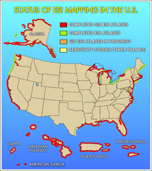
ESI maps are available in one format or another for the majority of U.S. coastal areas. Click image for larger view.
In 1979, the Ixtoc 1 exploratory oil well blew out, spilling 140 million gallons of crude oil into the Gulf of Mexico. During the two months the U.S. had to prepare for oils slicks from the well to reach the Texas coast, the first Environmental Sensitivity Index (ESI) maps were created by NOAA contractors to prioritize areas for environmental cleanup. Since that time, ESI atlases have been prepared for most of the U.S. shoreline including Alaska; Hawaii; the Great Lakes; and the territories of Guam, Puerto Rico, and the U.S. Virgin Islands.
This article looks at the evolution of how ESI maps have been created by NOAA for over 25 years.
ESI Maps: A History
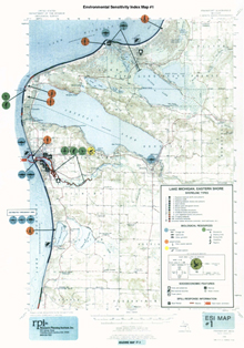
On early, hand-drawn ESI maps, information about specific plant and animal species or changes associated with seasons was limited. There was no “back of the map,” rather all details were provided in the introductory pages to each atlas or on the icons themselves. Above is an example from the Eastern Lake Michigan atlas prepared in 1985. Click image for larger view.
ESI maps were initially hand drawn over U.S. Geological Survey (USGS) maps. Areas along the shore were "ranked" in terms of their vulnerability in the event of a spill. Scientists used marker pens to color code the maps, making it easy to quickly identify high-risk areas. Icons printed on "sticky dots" were added to the maps to show the location of vulnerable biological species and socioeconomic features such as water intakes, archaeological sites, and managed areas.
The final product was a set of laminated 13.5" x 17" maps bound into a hard-copy atlas. The cost to produce such an atlas made mass production impossible. Generally, only three copies were made: one for NOAA's Seattle office of Hazardous Materials Response Project, one for the NOAA regional Scientific Support Coordinator, and one for the contractor who produced the maps.
Although the audience for the maps was small, their utility was unquestionable. Scientists, coastal managers, clean-up contractors, and oil companies used the maps for both oil spill preparedness and response activities.
Technology Enhances ESI Maps
Color Copiers and Database Improvements
Technological advances allowed for greater accuracy and distribution of ESI maps. Cost-effective, large-format color copiers quickly made 11" x 17" the preferred page size and improved ESI circulation. Advances in database technology made it practical to collect more information about species vulnerable to oil spills. Also, scientists could now collect more detailed information on seasonality and breeding activities that could affect protection priorities. However, it was the advancement of geographic information system (GIS) technology that had the most profound impact on the production and distribution of the ESI maps.
Geographic Information System Technology
A GIS is a computer system capable of capturing, storing, analyzing, and displaying data identified according to location. A GIS can be used to emphasize the spatial relationships among information on a map, making it possible to link, or integrate, information that is otherwise difficult to connect.
The first ESI atlas developed using GIS was produced in 1989. GIS software enabled a more precise presentation of the color-coded, ranked shoreline sensitivity. Biological resources were mapped using lines giving a general idea of the extent of a species and polygons that depicted the area in which a species could be found. Equally significant, the attributes of each polygon and point were now maintained as part of the GIS data structure.
Although the initial intent of using GIS for ESI mapping was to produce a high-quality, less-expensive paper product, it quickly became apparent that the GIS data themselves were in equally high demand. GIS allows planners and responders to focus on the resources that are relevant at a particular time of year and that occur in a particular area.
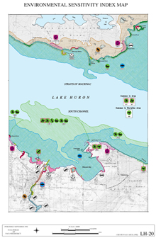
GIS technology allowed a more refined representation of the shoreline sensitivity values and greater detail of other resources at risk. Biology was now presented as polygonal areas of extent and details on the species represented and their seasonality was presented on the back of the map. This is an example from the Lake Huron ESI atlas prepared in 1994. Click image for larger view.
Tabular data can be searched to find information about a specific species or a group of species with similar characteristics. For example, it may be imperative to protect any nesting or fledging birds in the event of an oil spill. If a spill were to occur in February, you may find fewer species that meet the specified breeding criteria than if a spill were to occur in June. By highlighting the areas where these species do occur, you are able to quickly visualize the priority areas to protect.
It is also possible to use GIS in the opposite direction. For example, if a spill has already impacted an area, it may be important to figure out what species typically reside there. GIS allows the user to query by location in order to identify potentially impacted resources. GIS also allows the user to estimate how large of an area is impacted by a spill, which may help in calculating the number of response resources that may be needed.
GIS allows the user to play "what if" scenarios and prepare custom maps that are appropriate for the circumstances at a specific time.
The Exxon Valdez and ESI Guidelines
Also in 1989, the Exxon Valdez oil spill also had a significant impact on the demand for ESI maps. Public concern over the damage oil caused to the coastal environment was heightened. State and federal funds were directed to oil spill prevention and response strategies.
In 1991, California enacted the Oil Spill Prevention and Response Act (SB-2040), which made coastal sensitivity mapping a priority. Alaska also made sensitivity mapping of the entire state coast a priority. Similar legislation in other states increased the funds available for oil spill planning and protection activities, including the creation of ESI maps.
As a result of the increased demand for ESI maps, the Association for Oil Spill Information Management (AOSIM) committee was established and convened in Austin, Texas, in 1993. The goal of the committee, which included representatives from numerous states, NOAA, the Minerals Management Service, and industry, was to define the structure and function of ESI maps. It was important to develop a standard ESI format so responders who move from spills on different coasts would have maps with the same look, allowing them to easily extract resources at risk. To develop this format, AOSIM identified appropriate resources for inclusion, symbols to be used on hard-copy maps, and database structures for GIS.
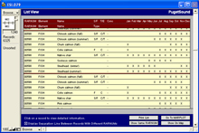
By selecting polygons or points from the biology or human use layers, you can see what species are present and when. Here is a view of the data table as it might appear when querying the fish layer. More detailed information can be viewed by selecting a specific species record. Click image for larger view.
From these discussions, NOAA's ESI contractor, Research Planning, Inc. (RPI), put together the first set of ESI guidelines in June of 1993. Based on these guidelines, the Marine Spill Response Corporation created digital versions of nearly all of NOAA's existing ESI maps. NOAA's Hazardous Materials Response and Assessment Division still use these digital data today for the few remaining states that have yet to be remapped.
The ESI guidelines have been updated and revised periodically throughout the years as technologies and environmental concerns have expanded. In 1994, NOAA and RPI redrafted the ESI guidelines. Since then, the guidelines have been revised twice, the latest version published in 2002. A fourth revision is expected to be published by 2008, based on discussions between some of the original AOSIM members and representatives from additional states and agencies about the future of ESI. The publication of these guidelines allows states and other agencies to develop coastal sensitivity maps that will meet the specified ESI standards. The states of Florida and Texas are examples where the guidelines have provided assistance for mapping of their coastal area.
ESI Today
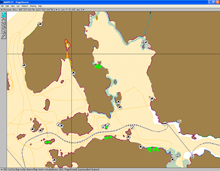
The free ESI Viewer software allows you to view and query the GIS data without having any GIS software installed on your computer. Here is an example showing the shoreline types, the invertebrates, the nests, and the human use points from the Guam ESI atlas. Click image for larger view.
Today, ESI maps have been produced digitally for approximately 90 percent of the United States and its territories. Many areas, like California and Georgia, are being mapped for the second or third time, taking advantage of improvements in technology to assure that the most up-to-date resource maps are available. Digital maps for other areas have recently been completed for the first time (Virginia in 2005) or will be completed soon (Maryland in 2007). A few places, like Long Island Sound, are still waiting for funding to complete the first digital ESI maps.
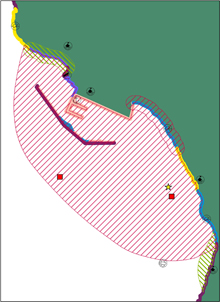
Above is an example from the Guam ESI map showing the ESI shoreline types as well as the birds, reptile, and human use layers. All points and polygons can be queried for species found in the area during any season. Click image for larger view.
NOAA still produces paper copy maps provided in hardbound ESI atlas. NOAA also publishes standard digital ESI data on CD/DVD as each new atlas is released. This digital product contains the entire atlas in Portable Document Format (PDF), as well as in multiple GIS formats. In an effort to reach as broad of an audience as possible, the ESI CD/DVD includes a free ESI viewer that allows even users without GIS software to view and query ESI maps and data.
(top)
Conclusion
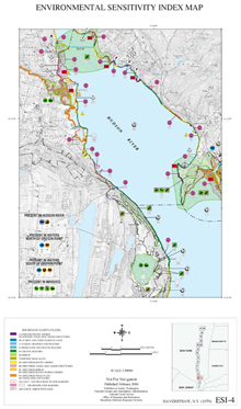
The ESI maps of today continue to have the same look and feel of the earlier ESIs, though they are a bit crisper in appearance. Today’s maps also provide greater detail about the resources at risk. Above is a map that was published in 2006 for the Hudson River showing numerous species as well as human use resources. Click image for larger view.
ESI maps have proven to have a long-term use and they are excellent tools for studying shoreline change and its effects on the distribution and concentration of plants and animals living near the coast. Environmental sensitivity mapping is still evolving and NOAA continues to play a major role in its evolution. NOAA, in cooperation with states and federal agencies, is committed to updating and improving these valuable tools to more efficiently and effectively prepare for oil spills and other environmental disasters and to preserve our most valuable natural resources.
